Predicting the Best Canvassing Locations for Democratic Voter Registration
Picking the right place to canvass is one of the highest-leverage decisions a voter registration program makes. We built a model that uses 2024 data from 2,262 canvassing locations across 11 states to predict partisan performance before a single form is collected.
Picking the right place to canvass is one of the highest-leverage decisions a voter registration program makes. A good location can double the share of Democratic registrants you collect. A bad one can burn through paid canvasser hours with nothing to show for it. So we asked a simple question: can we predict a location’s partisan performance before a single form is collected there?
This post summarizes our first research pass at that problem. We trained a model on 2024 voter registration data collected through Blocks, and we think the results are promising enough to build into the product — with some important caveats about how campaigns should use it.
The problem we set out to solve
Every voter registration program has to choose where to set up shop — which supermarkets, transit stops, college campuses, naturalization ceremonies, or community events to send canvassers to. Most programs make that call based on a mix of institutional knowledge, precinct data, and gut feel. That works, but it leaves a lot on the table, especially for new programs breaking into a district for the first time.
Our goal: give canvass directors a predicted "partisan score" for any location in their universe, so they can prioritize sites that are likely to yield the most Democratic registrants — even before the program has data of its own at those spots.
The dataset: 377,000 forms across 11 states
We pulled together every 2024 Blocks registration form we could get partisanship signal from. That came out to roughly 377,000 forms collected at 2,262 unique locations across 11 states: Arizona, California, Michigan, Missouri, North Carolina, Nebraska, New Mexico, Nevada, New York, Pennsylvania, and Texas.
Partisanship in voter registration data is messier than it sounds. Some states let applicants mark a party on the form itself. Some don’t — so our clients instead collect party lean through pledge cards. And for applicants where neither is present, we can match the form back to the voter file and pull a partisan score from TargetSmart.
To combine all three signals into a single outcome variable, we built a custom partisan score between 0 and 100:
- 100 if the party on the form or pledge card indicates the applicant is a Democrat
- 0 if the party on the form or pledge card indicates the applicant is a Republican
- Otherwise, the applicant’s partisan score from a TargetSmart voter‑file match
We then took the mean of that score across each location and used it as the dependent variable. For the final model we only kept locations with at least 30 applicants in 2024 to keep the noise down.
What we fed the model
The independent variables fell into four buckets:
- Context: the state the location sits in, and whether the program was explicitly partisan
- Demographics of the surrounding census tract — age, race, and gender proportions from the voter file
- Tract‑level average partisan score from a January 2024 voter file
- 2020 precinct‑level election results joined to locations via spatial geometry
- Google Places category for the location
- Total forms collected at the location in 2024
A note on 2020 vote data: we would have preferred to use more recent precinct results, but 2020 is the newest dataset that cleanly joins to our locations by geometry. Correlations with location partisan performance were weaker than we expected, and one of our next research steps is getting 2022 precinct data into the model.
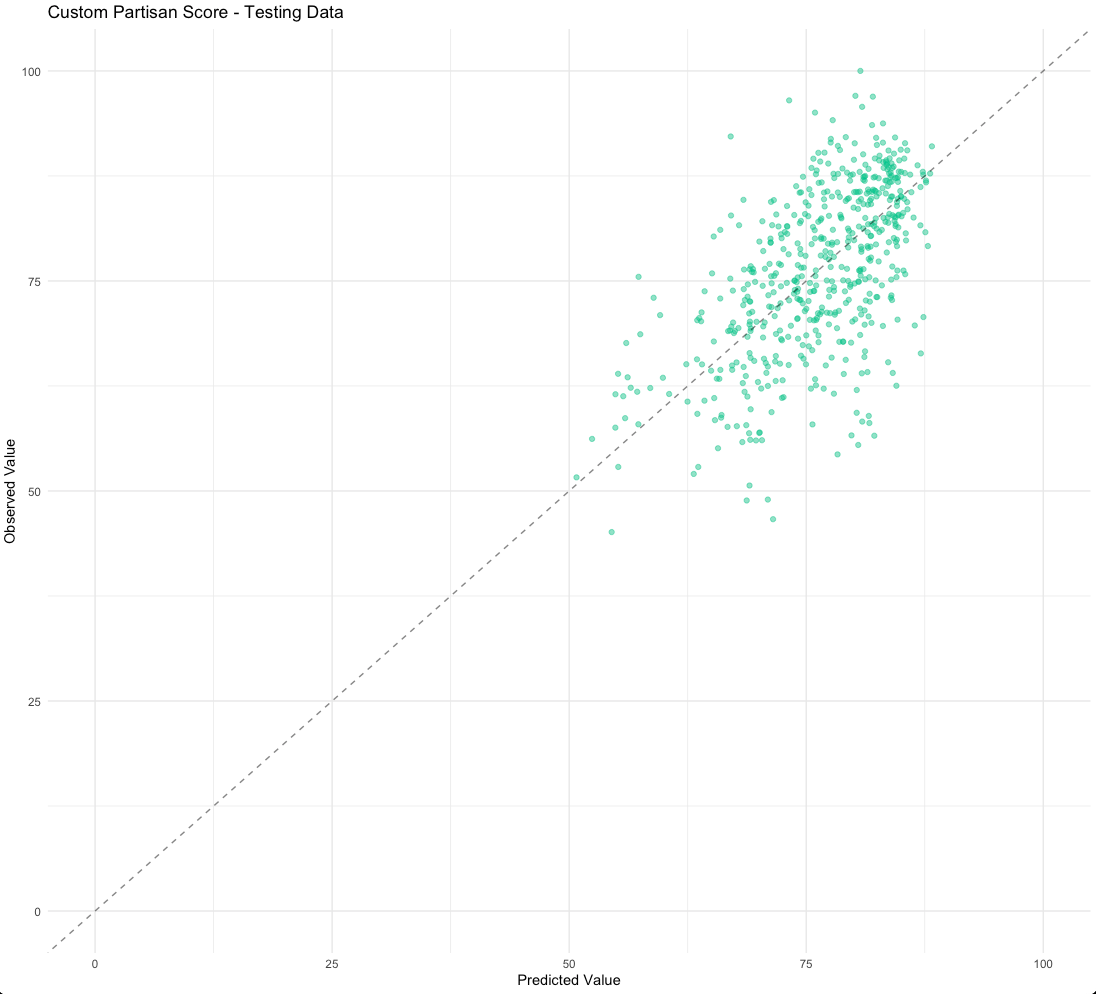
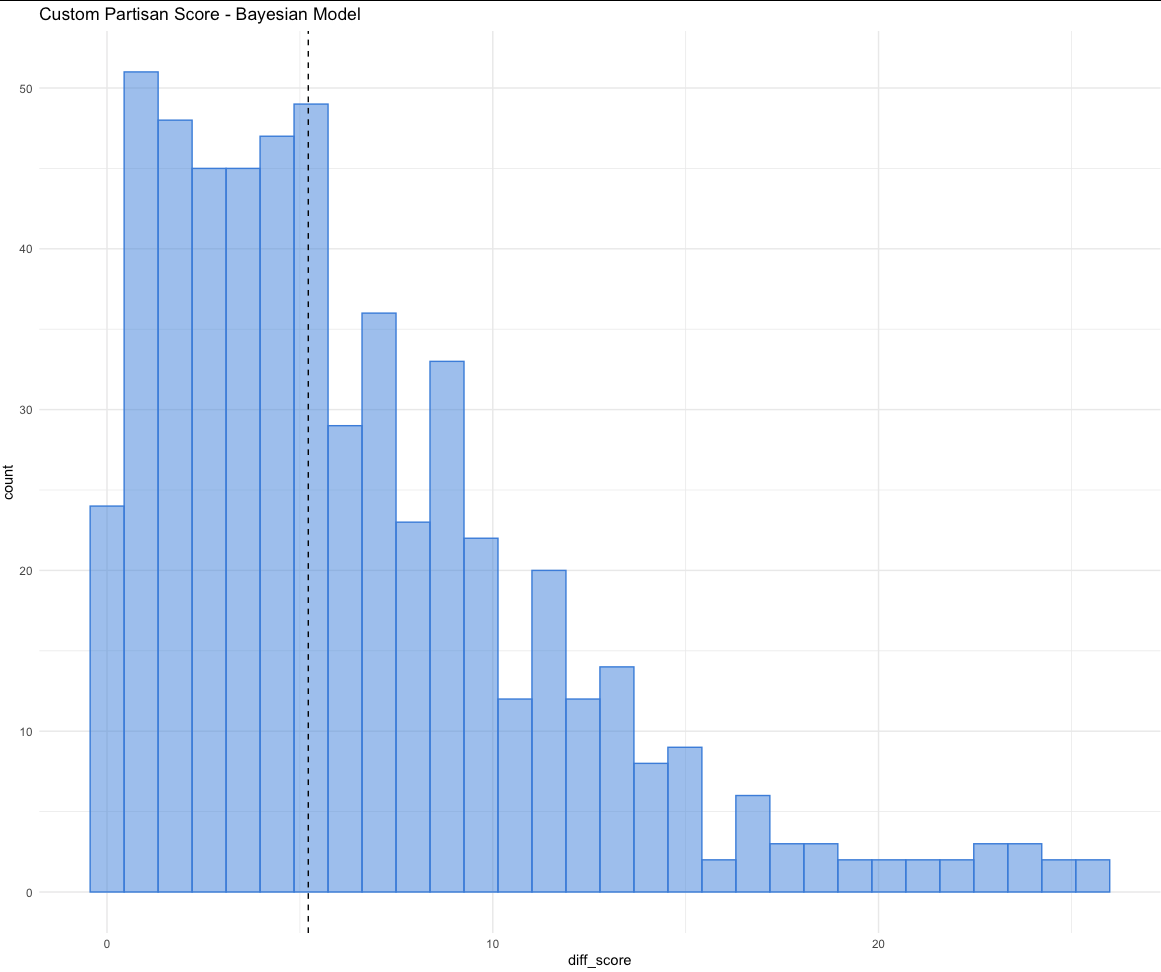
Picking a model: Bayesian linear regression won
We tried a handful of approaches — logistic regression on a binary "likely Democrat" label with two different partisan score cutoffs (50 and 65), and regressions on the custom 0–100 score described above.
The Bayesian linear regression predicting the mean custom score turned out to fit best. Because we knew in advance that the score is bounded between 0 and 100 and that the distribution is left‑skewed (Blocks clients tend to register Democrats at higher rates), we could bake that knowledge into the priors — a good fit for a Bayesian approach.
What the model tells us about location partisanship
Beyond the raw predictions, the model surfaced some interesting correlations. The biggest effects after state and "partisan program" dummies came from:
- The average partisan score of the census tract around the location (strong, stable coefficient)
- 2020 precinct vote share (meaningful, but weaker than we’d hoped)
- Race and gender composition of the tract — though with larger standard errors, so magnitudes are less certain
- Location category from Google Places — smaller effect than we expected; a good sign that the 18‑category grouping is too coarse and worth refining
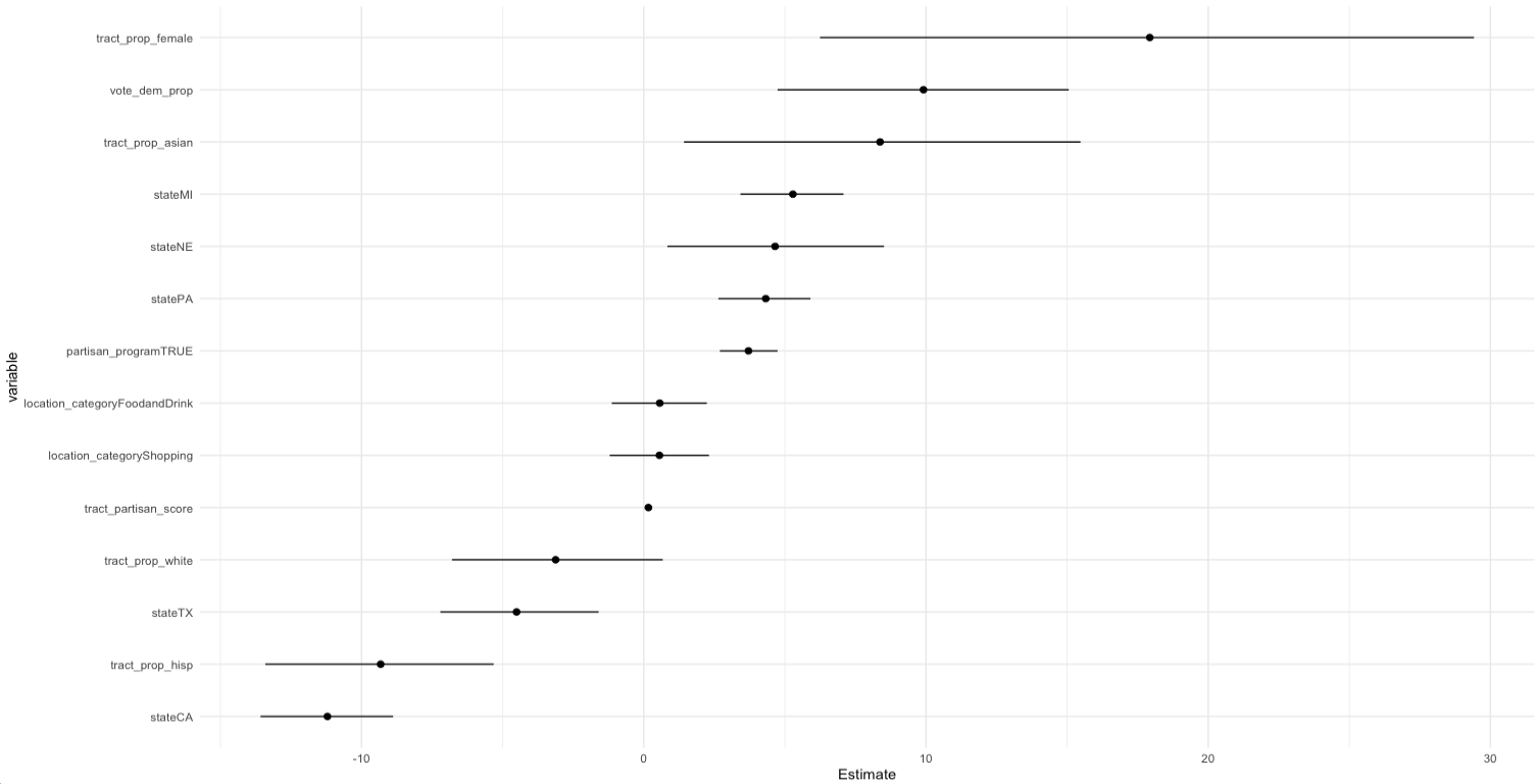
State effects were large enough that we think any production version of this model will need state‑specific calibration — Texas, which doesn’t collect party on forms, behaves very differently from Arizona or Pennsylvania.
Where the model works — and where it doesn’t
An R² of 0.47 is meaningful but not magic. We think the honest way to describe this model’s utility is:
- Good at separating generally better locations from generally worse ones
- Good for programs that are new to a district and have no data of their own yet
- Useful for clients who can’t collect party data directly (e.g., Texas programs without pledge cards or a voter‑file subscription)
- Not precise enough to confidently rank two similar locations against each other
- Less useful once a location already has hundreds of forms collected at it — at that point, real partisan performance data beats any model
How we’ll surface this in Blocks
Predicted scores are only useful if they show up at the right moment in the canvass director’s workflow. We’re prototyping two features that use them:
Prospecting map for new regions
A dot‑density map where each potential location is colored by its predicted partisan score. Click a dot to see the prediction, a confidence interval, and any current real data at that location. Filter by district, county, or congressional boundary so directors can quickly answer "if I want to register Democrats in PA‑12, where should I send canvassers this weekend?"
Hybrid view for established programs
A second map view where dot color is still driven by the predicted score, but dot size reflects forms already collected. That keeps the predictive signal visible for new or underused sites while giving real collection data priority at established ones.
What’s next
- Pull 2022 precinct vote data into the feature set and retest
- Re‑cluster Google Places categories — half our locations fall into "Food & Drink" or "Shopping" today, which is too coarse to be useful
- Reprocess historical forms through our Azure OCR pipeline to unlock more training data
- Break block‑group demographics into more granular sub‑categories (age×race interactions in particular)
- State‑specific model calibration so we can ship confidently in states like Texas and Missouri where data quality varies
Why this matters for organizers
Voter registration is a numbers game, but it’s not only a numbers game. Every form your canvassers collect costs real money and real volunteer time. Even a modest lift in partisan collection efficiency — a few more Democratic registrants per canvasser shift — compounds across a full cycle.
The goal of this work isn’t to replace the judgment of experienced canvass directors. It’s to give them one more data point when they’re choosing where to deploy limited resources, especially in unfamiliar territory. If you’re running a voter registration or canvassing program and you want to talk about how this could plug into your operation, we’d love to hear from you.